Create a new chaos dashboard
This section will guide you through creating a new chaos dashboard, and creating custom visualizations for various entities of a chaos experiment.
Before you begin
Refer to overview of chaos dashboards to understand what a chaos dashboard is, and how you can view a predefined chaos dashboard.
Create a new visualization
To create a new visualization in a dashboard, follow the steps mentioned below.
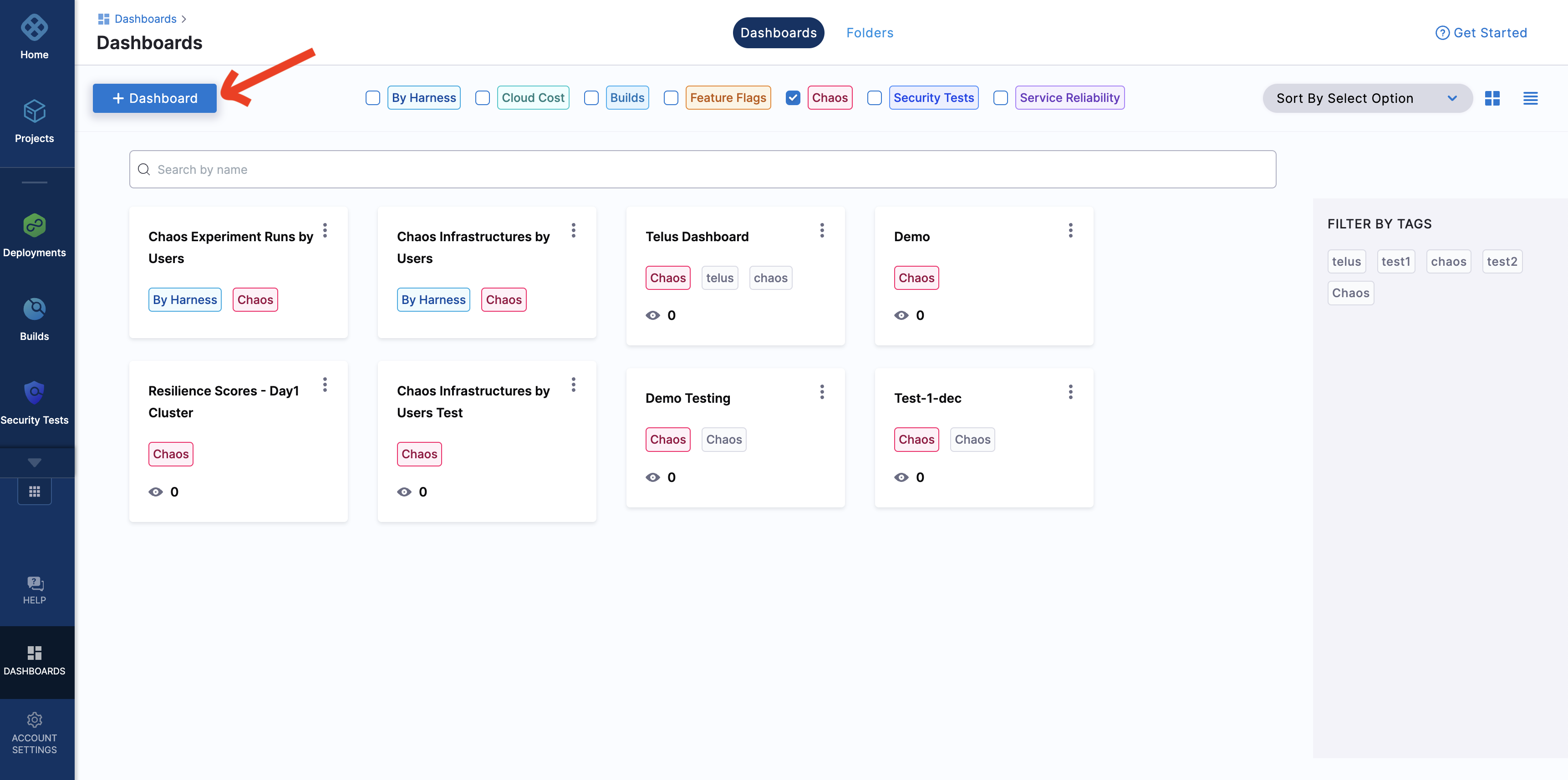
Step 1: Click Dashboard
To create a new dashboard, click Dashboard.
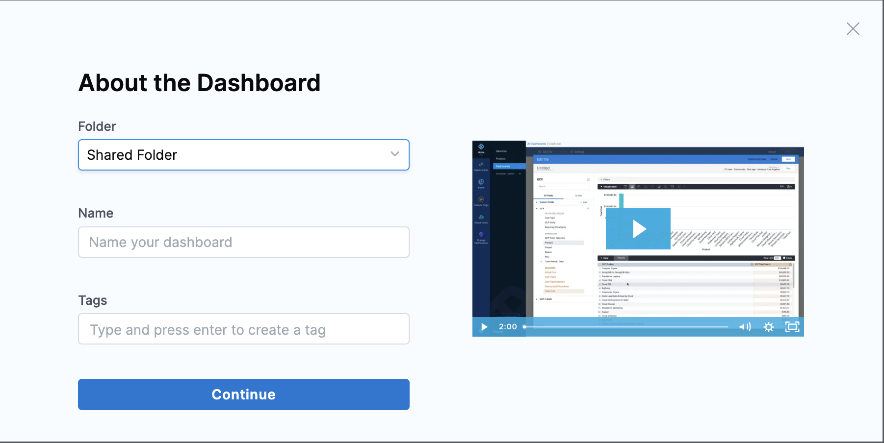
Step 2: Specify parameters
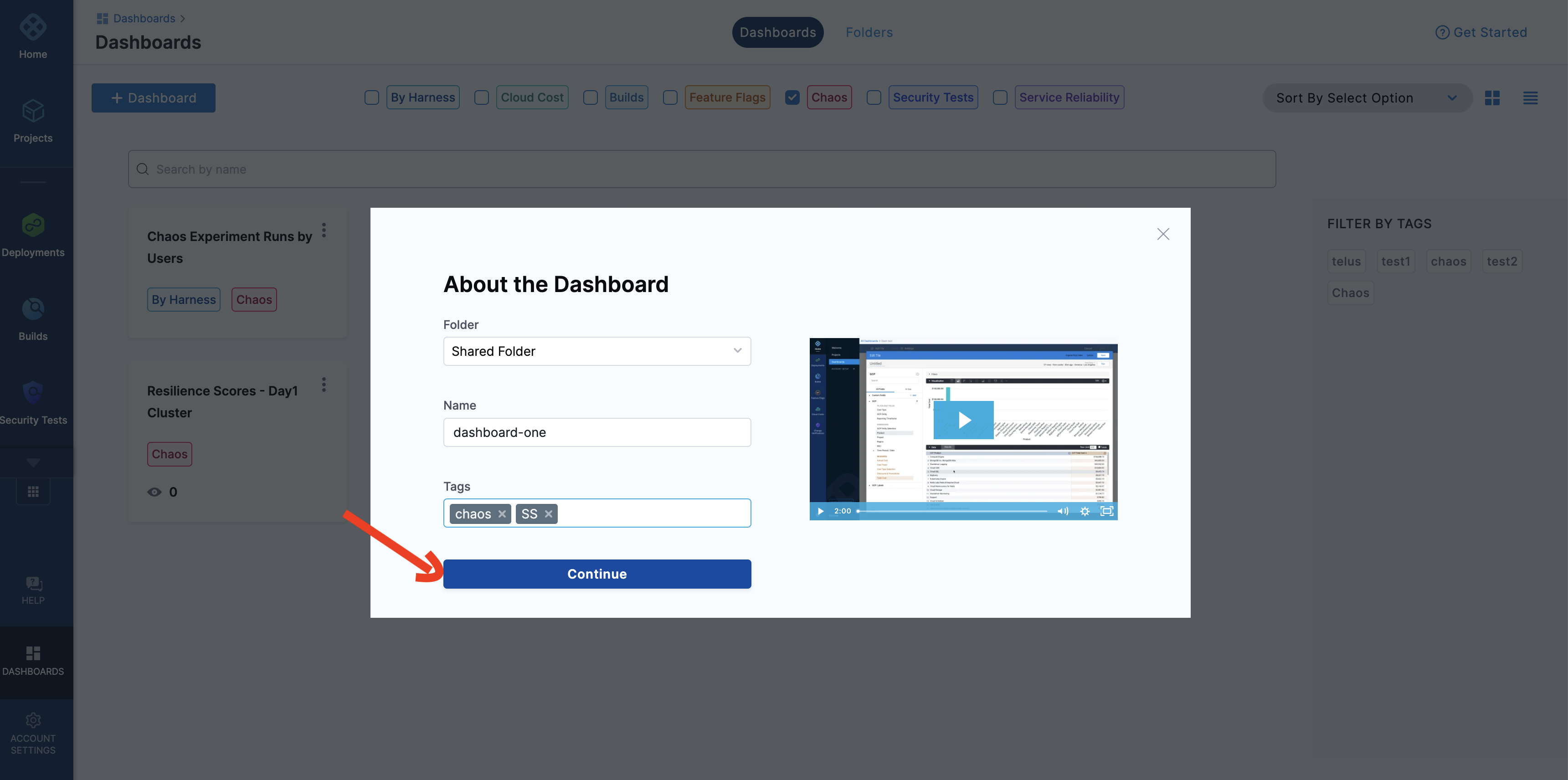
Add values for Folder, Name, and Tags (compulsory).
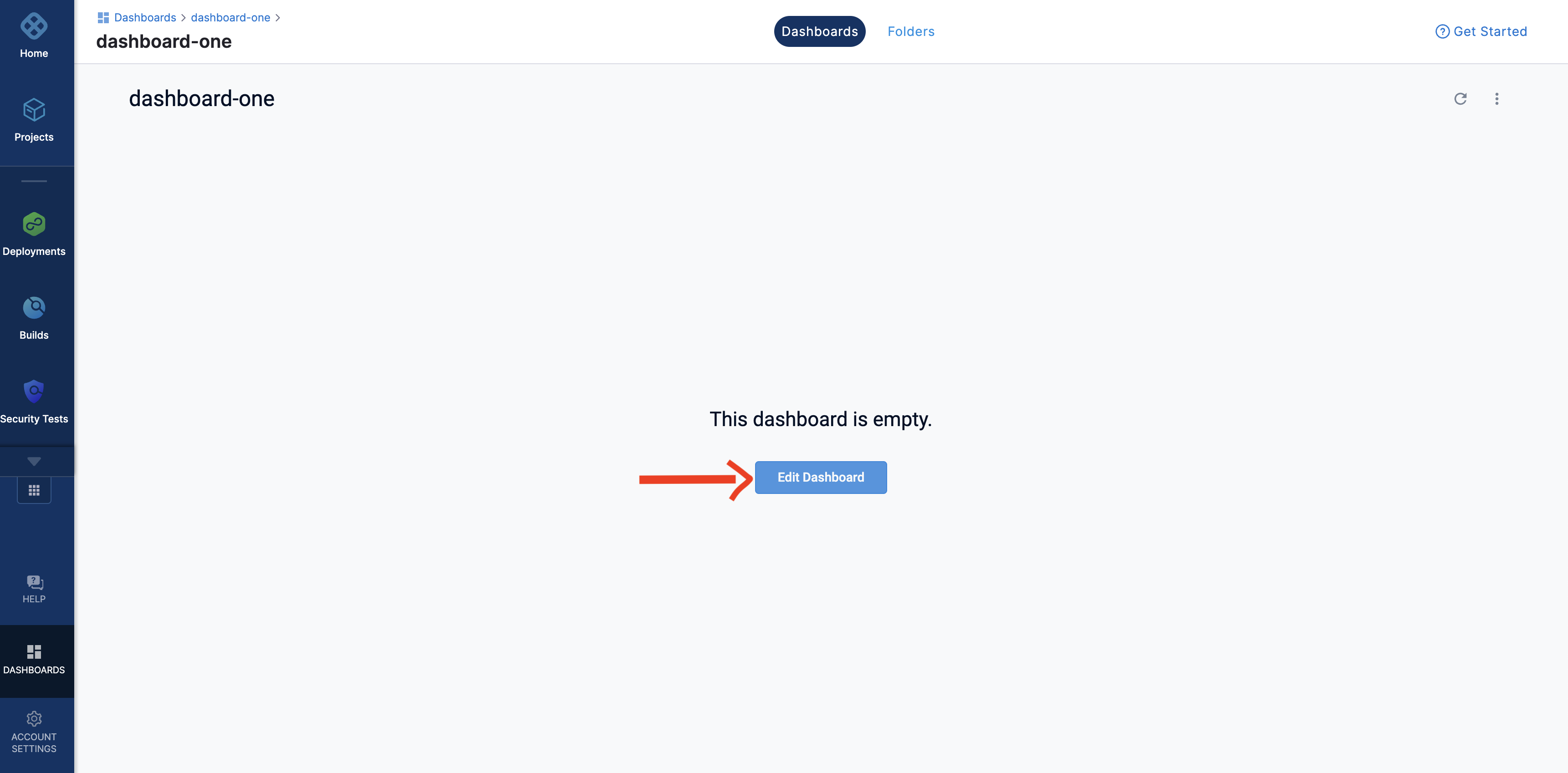
Click Continue. This creates an empty dashboard. You can add visualizations (also known as panels) by editing this dashboard.
Step 3: Edit previously created dashboard
Click Edit Dashboard to edit the dashboard that you created in the previous step.
Don't forget to add the Tag values because this is the field based on which the dashboards are filtered by modules.
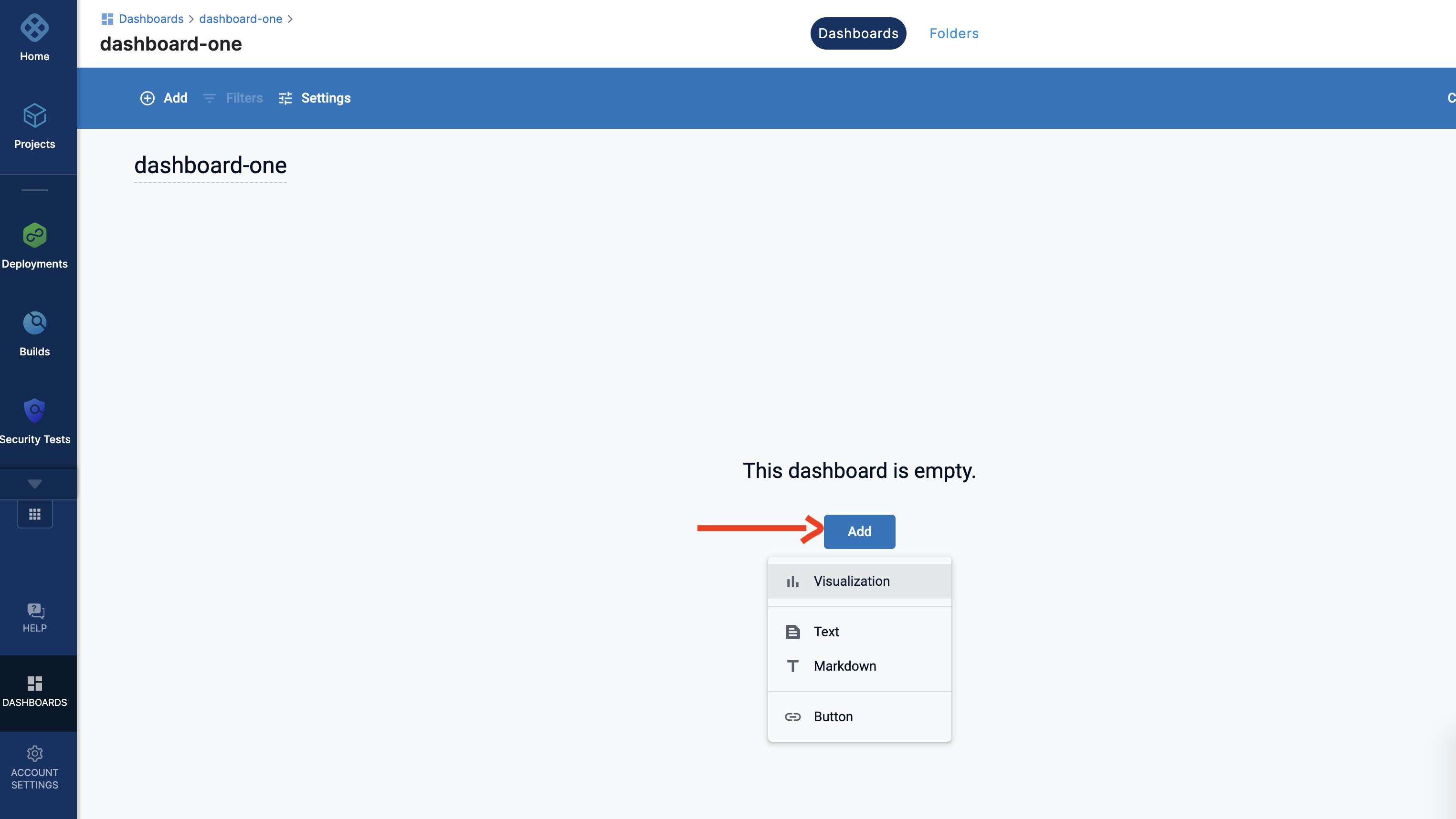
Step 6: Add a visualization dashboard
Click Add and select Visualization.
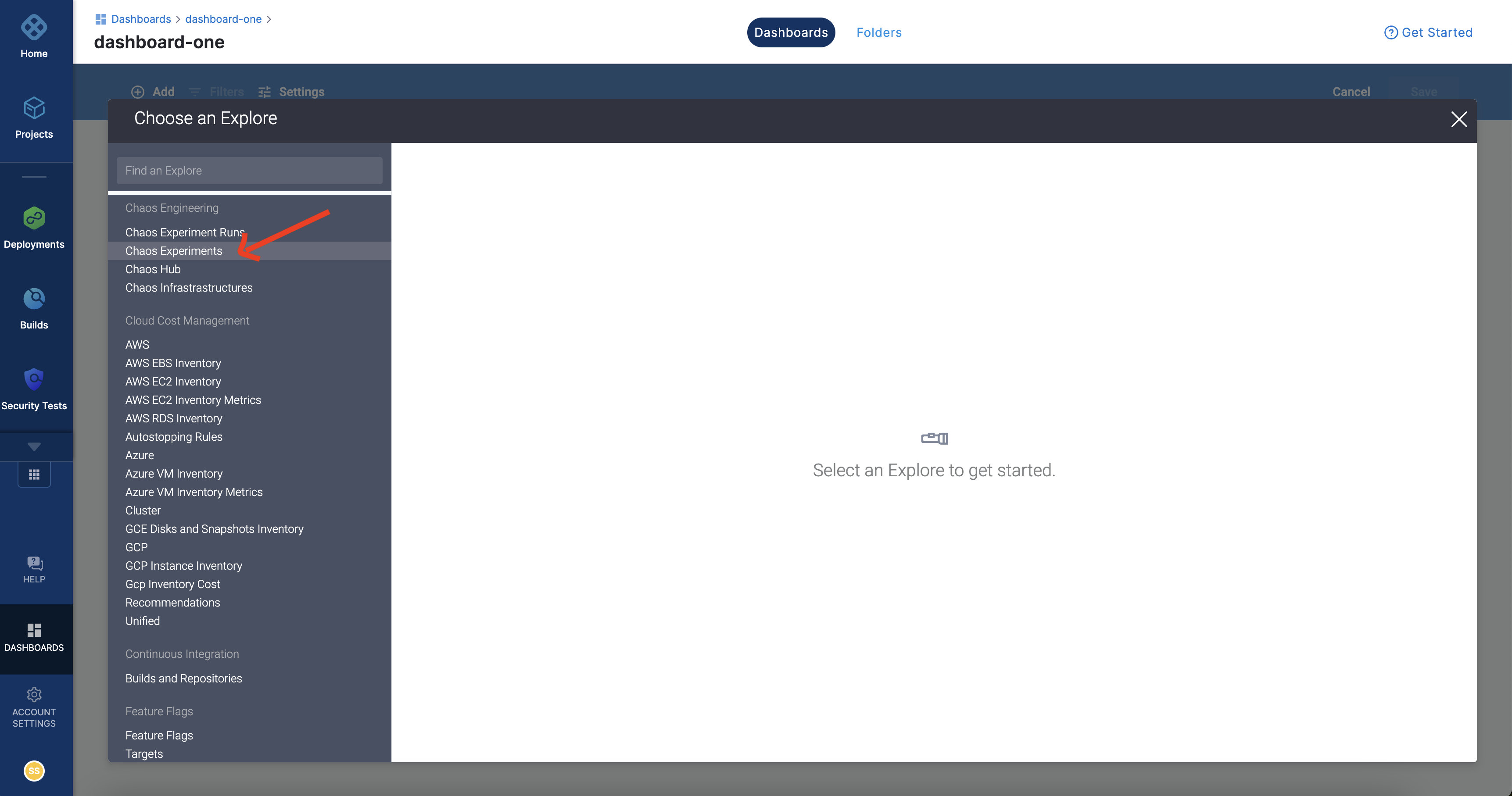
Step 5: Select a table
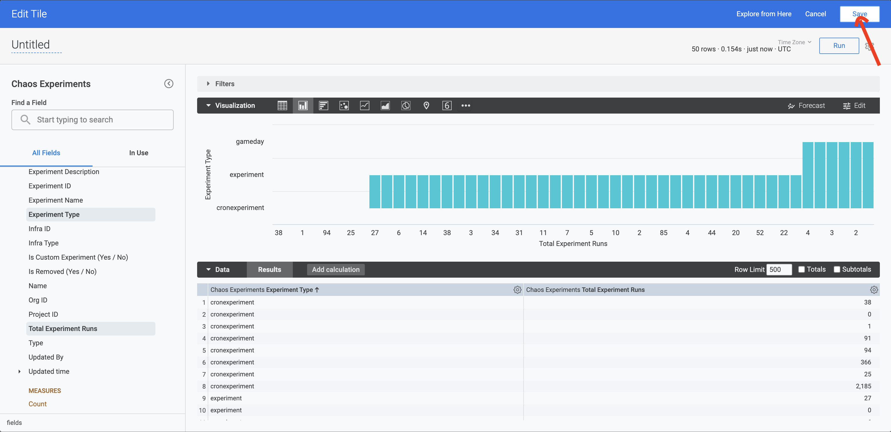
Select a table whose fields you wish to visualize. HCE currently supports Chaos experiment runs, Chaos experiments, Chaos hub, and Chaos infrastructures. In this example, select Chaos experiments.
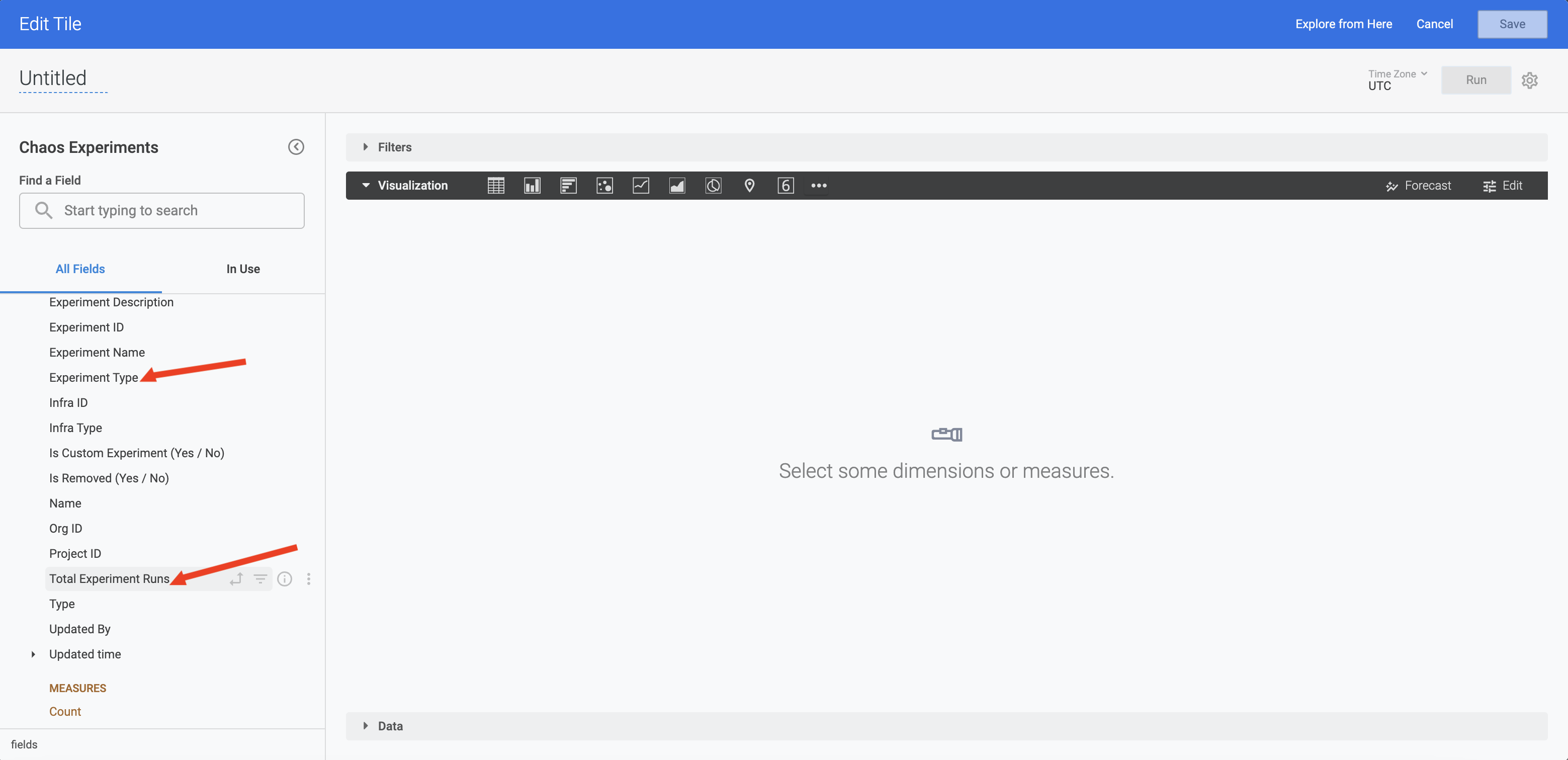
Step 6: Select fields
Select the 2 or more fields which you wish to visualize. In this example, select Experiment Type and Total experiment runs.
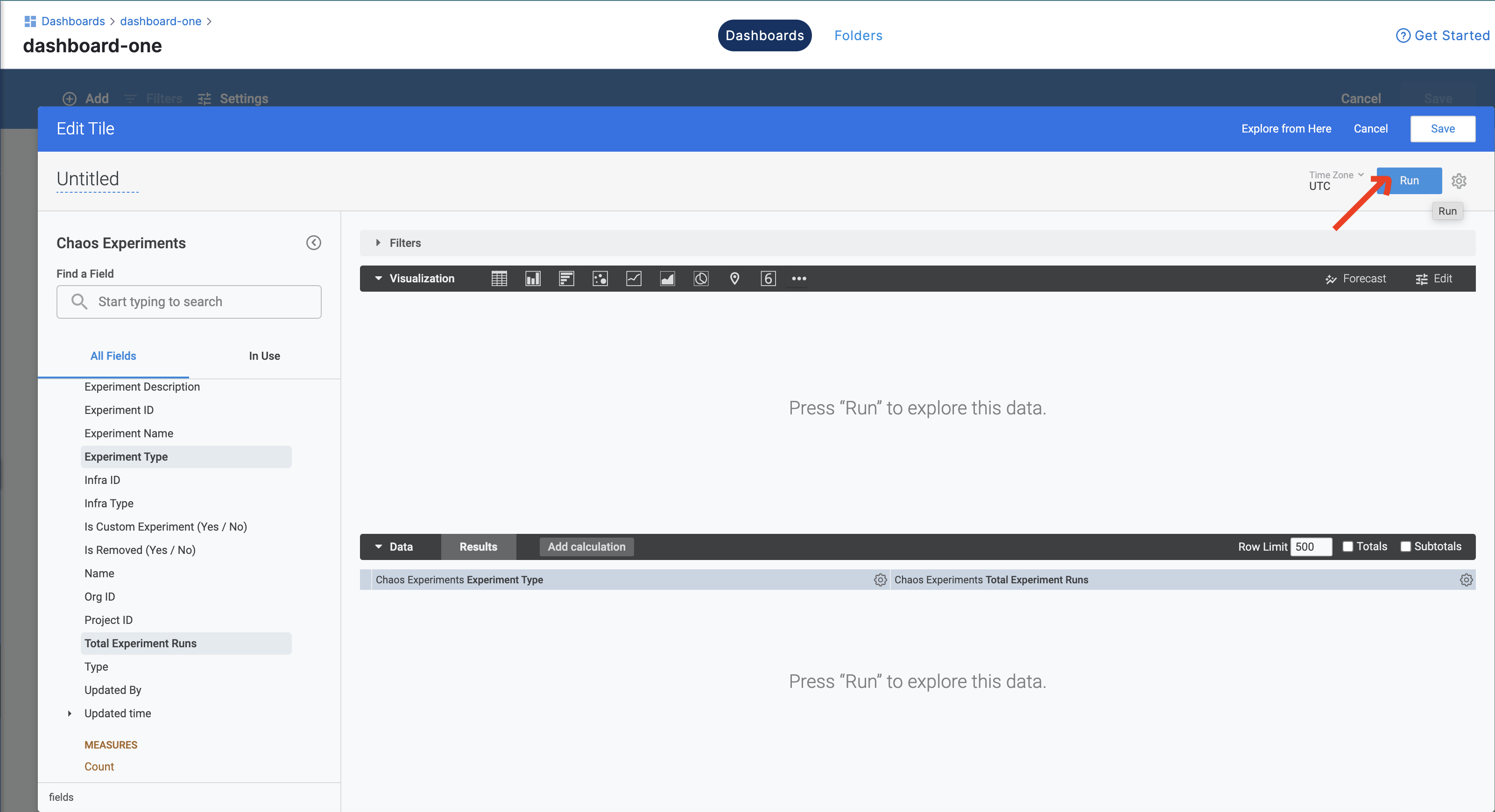
Step 7: Click Run to view the graph
When you click Run, chaos dashboard displays the graph of Total experiment runs (x-axis) versus Experiment Type (y-axis).
Step 8: Click Save (Optional)
If you wish to save your visualization, click Save. Otherwise, you can Cancel and add visualizations again.
You can find the definitions for many of the fields here.